Champagne
A pale golden beige named after the wine rather than a standardized shade.
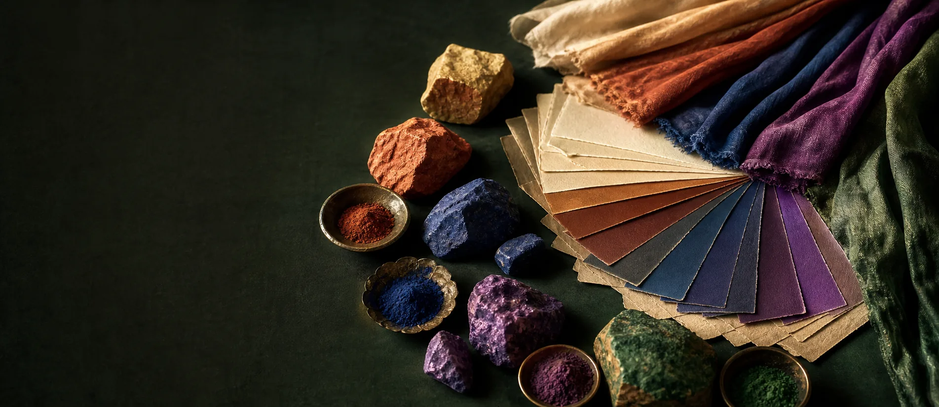
Key facts
- Representative hex
- #E8D9B5
- Family
- beige
- Undertone
- gold
- Traditional use
- silk, interiors, evening accessories
Landmarks
A pale golden beige named after the wine rather than a standardized shade. That first definition places Champagne, but it does not yet explain why the entry rewards close attention. Like every color, it is understood through facts, uses, and the habits by which viewers learn to connect them. The purpose is not to accumulate distinguishing signs. It is to recognize a coherent pattern and then ask what that pattern makes newly visible.
The essential data offer a concrete point of departure. This atlas proposes #E8D9B5 as an editorial reference, not a standard: beige family, golden undertone, with uses in silk, interiors, and evening accessories. That qualification matters. Digital palettes demand one exact value, while “champagne” in ordinary use covers a range of very pale yellows that may be grayer or warmer.
A history to read
The name comes from Champagne wine, but the wine's appearance is not fixed. The Comité Champagne describes colors ranging from yellow-green, common in Chardonnay-led blends, to golden yellow. Age, grape varieties, vinification, glass, and light all modify perception. Decorative vocabulary retained an impression from that range: luminous pallor, restrained warmth, and an immediate association with celebration.
Dictionaries confirm this breadth rather than a single recipe. Merriam-Webster places the color between pale orange-yellow and light grayish yellow-brown. The term moves among wine, fashion, interiors, and product design. In each setting it offers a warmer alternative to ivory and a quieter one to gold. Its stability comes less from a measurement than from this relational position.
How to recognize it
Recognition begins with value, saturation, undertone, and chromatic neighbors. These criteria should not be checked mechanically. They work as a cluster: one clue may mislead, while several agreeing signs support a stronger reading. The surrounding conditions matter as well, because scale, light, support, and neighboring objects can alter perception. An isolated photograph usually reveals less than an observation that is situated and compared with another example.
A reliable habit is to describe before naming. Which lines dominate? Where does contrast gather? What element establishes the rhythm? Which trace discloses a hand, technique, or convention? This short pause protects the viewer from quick analogy. It then becomes possible to use the term Champagne precisely, stating whether the example is canonical, a late variation, or merely a visual relative.
Material, form, and use
Material determines much of the effect. On silk, champagne catches light and can appear almost pearlescent; on matte paper, it approaches parchment; on metal, it borrows from gold without reaching its brilliance. A backlit screen makes #E8D9B5 look brighter than a nominally equivalent wall paint. Any serious comparison must therefore name the support, finish, and lighting.
Use completes the material reading. In the palette, Champagne is never wholly isolated: it organizes a relation among the person who presents, the person who receives, and the setting that makes the exchange legible. The same form can appear solemn, familiar, or contrived depending on distance and rhythm. Understanding use therefore means understanding a scene, its tacit expectations, its freedoms, and its potential departures.
What detail changes
The most instructive details are rarely the loudest. A turn of tone, a joint, an undertone, a proportion, or a temperature can alter the whole without immediately calling attention to itself. Such details often distinguish a controlled realization from a literal imitation. They also show that elegance does not necessarily come from abundant means, but from the accuracy with which each element answers the others.
With Champagne, learning to see detail does not mean fetishizing authenticity. Objects are restored, texts re-edited, recipes adjusted, and customs moved into new settings. The task is to distinguish a structure that persists from characteristics that can evolve. This makes knowledge more flexible: it supports comparison, clarifies transformation, and prevents a variation from being dismissed simply because it fails to match an ideal image.
Looking without simplifying
Every cultural category creates a risk of simplification. It assists classification but can conceal exchanges, exceptions, and disagreement. Champagne should not become a label applied too quickly. Sources, dating, provenance, and the context of presentation remain important. Where they are absent, a cautious formulation is better than a spectacular certainty. The quality of attention is also measured by its ability to leave a question open.
Such caution does not reduce pleasure; it makes pleasure more durable. Accurate observation lets a reader return with new hypotheses, compare examples, and listen to other interpretations. Knowledge becomes a conversation rather than a verdict. It offers ways to look, listen, or receive more attentively without reducing experience to a test of cultural recognition.
Within a collection
In an editorial atlas, Champagne acquires meaning through proximity. Comparison with a neighboring entry reveals nuances that a definition leaves in shadow. A counterexample exposes limits. A thoughtful collection does not impose an automatic hierarchy; it composes paths. A reader might begin with a color, move to an interior, and continue toward a rule of hospitality or a text that uses the same imagery.
This circulation encourages active memory. Instead of retaining a list of facts, readers connect a form to a gesture, a place to a material, and a date to a transformation. Such links aid recall while preserving complexity. They also reveal borrowings and survivals: an idea can leave its original setting, change function, and continue to produce effects long afterward.
Going further
A simple method is to choose two documented examples of Champagne, then note three similarities and three differences before reading their labels or commentary. The exercise slows perception and reveals the criteria one uses spontaneously. It works with a reproduction, a physical object, or a written description. Differences among those supports are part of the lesson because each reveals certain aspects and hides others.
The sources below are starting points. They help verify landmarks, widen context, and distinguish everyday vocabulary from specialist usage. Their purpose is not to close the article but to make its claims traceable. Champagne becomes less a final answer than an instrument of reading: a precise, curious, and revisable way into a world of forms, practices, and ideas.
Sources
- Merriam-Webster: Champagne
The dictionary documents champagne as a color term ranging from pale orange-yellow to light grayish yellow-brown.
- Comité Champagne: Champagne from cellar to table
The trade body's guide describes the wine's real variation from yellow-green to golden yellow, showing why its name cannot denote one fixed shade.